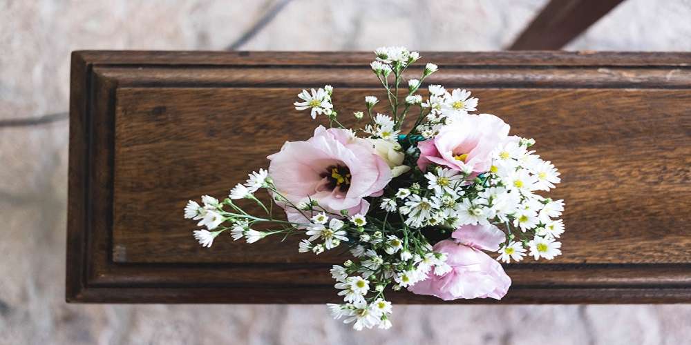
enjoyed wearing or the colours that decorated their home. It will give insight into colours they would appreciate at their service. Bright colours like red, yellow, and orange suggest the person was energetic and lively. Pastels like light pink, blue, and green create a more soothing ambiance. Dark or neutral colours like black, gray, and brown are appropriate for someone more serious or traditional. Picking colours theme for a funeral, so here are some tips which helped to choose the right color theme for a funeral

Think About the Tone You Want to Set
The colour theme should match the tone you want to convey. A bright colour scheme sets an upbeat, celebratory tone. Softer colours create a respectful, unhappy environment. Dark, muted colours come across as serious and formal.
Consider having a vibrant colour theme if the person enjoyed life fully and would want mourners uplifted. Pick calming colours for a dignified, peaceful ceremony. Stick with traditional, darker hues if you prefer a formal, elegant memorial.
Get Input from the Family
It’s important to get input from close family when choosing the colour scheme. The theme should resonate with the next of kin and others who were close to the deceased. They may have suggestions based on what they know their loved one would have liked.
Consult with the deceased’s spouse, children, siblings, or parents. Ask if certain colours hold special meaning or evoke particular memories. Using colours with significance to the family will personalize the service
Coordinate with Other Design Elements
The colour theme should complement other funeral design choices. Whether flowers, casket or urn, multimedia displays, or attire, keep the colours cohesive scheme. It creates a polished, thoughtful look.
White flowers beautifully enhance any colour scheme. Request attendees wear black, gray, or other neutral colours so outfits don’t clash with the decor. Pick muted casket or urn colours as the focal point and use bright flowers as accents.
Consider Season and Venue
Take the season and the venue into account when selecting colours. Some choices fit better for certain times of the year. The venue may also lend itself better to warm or cool tones.
Pale pastels work well for spring. Deep reds and oranges match fall leaves. Snowy winters call for icy blues and silvers. Outdoor venues look best with bold colours, while indoor settings are enhanced with softer shades.
Conclusion
When picking colours theme for a funeral, think about the person who passed away, how you want the event to feel, and what their family thinks. Also, consider where and when the funeral is happening. Choose colours that show who they are and make people feel better during this sad time.


